UPDATE June 2018: I would like to assume that, based on this post/ conversation, Google has updated the checkbox web component guide with the following warning:
Warning: Just because you can build a custom element checkbox, doesn't necessarily mean that you should. As this example shows, you will need to add your own keyboard, labeling, and ARIA support. It's also important to note that the native<form>element will NOT submit values from a custom element. You will need to wire that up yourself using AJAX or a hidden<input>field. For these reasons it can often be preferable to use the built-in<input type="checkbox">instead.
Great job team!
At the Polymer conference, a new resource
How To: Components
was announced to help developers build web components responsibly. I
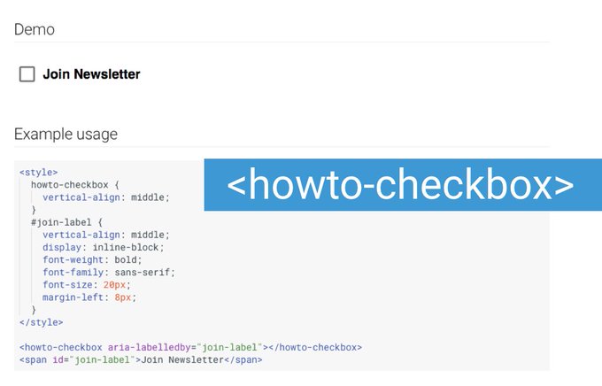
was a little intrigued because the screenshot attached to the tweet
showed code on <howto-checkbox>
Hot off the press from @polymer summit. Check out "HowTo: Components" – guide to build common UI patterns with WC. https://developers.google.com/web/fundamentals/...

Of course, I had to ask, what's wrong with a plain
<input type="checkbox" /> and surprisingly I got
a response from someone on the Chrome dev team.
Devs want to style form elements.
I won't argue that point, leaving form design up to browsers is just
no fun. As I pointed out though, for checkboxes and radio buttons we
can use some basic CSS to style. In fact, with the exception of
native <select> you can style pretty much all
form elements with pure CSS. Even with native select's, you can
style everything except for the options.
I got another response though, and this one was even more surprising than the first:
And HowTo Components don‘t require/recommend any tooling. It's just code for you to read so you can learn the patterns for your own CEs :)
I can appreciate the attention to accessibility and this team is doing some good work. Any time you can expose developers to accessibility, an angel gets wings in heaven. In this instance, I would have to invoke the first rule of ARIA:
If you can use a native HTML element or attribute with the semantics and behavior you require already built in, instead of re-purposing an element and adding an ARIA role, state or property to make it accessible, then do so.
Of course, the rule goes on to state an exception for not being able to style an element as desired. I just want you to know that if you are only using web components so that you can style a checkbox, then you may not need a web component after all. Over-engineering not required!
2 lines of HTML, 75 lines of CSS (it could be way less if I used images, instead I created all states with pure CSS), and 0 lines of JavaScript, here is an accessible checkbox. I am certainly not the first to do this, there are quite a few examples of CSS-only inputs that are accessible (Heydon Pickering, Adrian Roselli), this is just my version
The screen reader and keyboard experience are identical to the web component for the most part, but there are some really important benefits that I want to point out:
- Reduced surface area for bugs. No JS to break.
- No ARIA! Relying on ARIA for something as simple as a checkbox puts you at the mercy of assistive technology/ browser combinations. See item 1.
- No additional JS to get the value of the checkbox to post back to a server.
- No additional HTTP requests for images. The image used in the web component demo took a noticeable amount of time to download on my mobile phone after checking the input.
- Using the label as a target is still in tact. Users heavily rely on this.
- Indeterminate state included. Not the web component couldn't, I just added it to mine.
- At the end of the day, it's still a plain checkbox. It will work!
The other examples they have for tabs and tooltips are fine and use
the official ARIA Authoring Practices as a source, I think those
definitely make better sense as a web component. In this case, I
think it would be more responsible to at least mention in the
documentation that using a plain checkbox would be the preferred
route since this web component makes it harder to be as accessible
as intended, considering things I mentioned above. We often use the
cautionary tale of trying to create you own button instead of using
the <button> element, and I think trying to
reinvent the checkbox in this manner falls in that category. For
checkboxes and radio buttons, you might not need a web component.