Good Morning!
Gerard K. Cohen
Lead Accessibility Strategist, Wells Fargo Digital Solutions for Business (DS4B)
- Slides: http://bit.ly/2OxNPro
- @gerardkcohen
Custom Select
Horror movie trailer: Horror! Shock! Frenzy! Devastation! As the most grotesque monstrosity of all breaks loose!
Custom select dropdowns are pretty and all but if they’re not properly accessible then you should probably not be showing them off. Also, nothing beats the usability of a native select UI on mobile, no matter how pretty. In other words: stop breaking the usability of native elements in favor of aesthetics that your users probably don’t care about half as much as you do... or at all.
Problems with Custom Select
Video: What Is This Thing and What Does It Do? From NEJS Conf 2018. Source: YouTube
Problems with Custom Select
Nobody ever does all that sh*t!
It's hard af
Reasons for Custom Select
- Truncated list items on mobile.
- Multiple selections.
- Better Grouping options.
Styling
ARIA Authoring Practice: Listbox
- Not fully supported.
Because the purpose of this guide is to illustrate appropriate use of ARIA 1.1 as defined in the ARIA specification, the design patterns, reference examples, and sample code intentionally do not describe and implement coding techniques for working around problems caused by gaps in support for ARIA 1.1 in browsers and assistive technologies.
Except in cases where the ARIA Working Group and other contributors have overlooked an error, examples in this guide that do not function well in a particular browser or with a specific assistive technology are demonstrating browser or assistive technology bugs. Browser and assistive technology developers can thus utilize code in this guide to help assess the quality of their support for ARIA 1.1.
Currently, this guide does not indicate which examples are compatible with mobile browsers or touch interfaces. While some of the examples include specific features that enhance mobile and touch support, some ARIA features are not supported in any mobile browser. In addition, there is not yet a standardized approach for providing touch interactions that work across mobile browsers.
ARIA Authoring Practice: Listbox
- Not fully supported.
- Not a form element.
- Optgroup?
Scene from The Matrix: Make a choice, pick the red pill or blue pill.
Scene from The Matrix: You picked the red pill!
The parts:
- HTML, CSS, Vanilla JavaScript.
- Native Select (progressive enhancement).
- Span.
- Unordered list.
- ARIA.
Inspiration
- ARIA 1.1 Pattern.
- Native Select on various platforms.
Keyboard Interaction: Select Trigger
- SPACE, UP, DOWN to display the list.
- Focus moves to unordered list.
Keyboard Interaction: Option List
- UP/ DOWN to navigate the items, but they do not cycle. Navigating does not make a selection.
- HOME moves to the first item in the list.
- END moves to the last item in the list.
- Type-ahead (printable characters).
- SPACE will select item, close list, and focus on trigger.
- ESC will close the list and focus on trigger without making a selection.
- Safari: TAB is trapped.
Mouse/ Touch Interaction
- Tap/ click to open.
- Tab/ click to select.
- AT: Swipe to navigate.
Discoveries, Tips, and Hacks!
role="combobox" vs button
- Native selects on windows announce as combobox.
- combobox is recognize as a form element.
- Because of combobox role, certain automated tests will complain because there is no textbox child.
- aria-required not allowed on buttons.
aria-selected not announced
- added ", selected" to the option aria-label.
Firefox not announcing combobox content
- set the aria-label to the selection + field name.
aria-describedby
- EDGE did not announce aria-described information. Log a defect?
- iOS and announced after a brief pause.
- JAWS and IE11 announced instructions every time.
Mobile (iOS)
- Important! Render list right after the trigger.
- Listen for focus events on the document.
- VO focus stays on combobox.
- Trigger (combobox) and selected states announce twice.
Form Controls
- Native select under the hood.
- Submitted or serialized.
- Easy validation.
Design
- Overscroll: overflow: hidden on body
- List positioning (selected item in middle).
- Selected Check mark.
Demos
Windows 10, Firefox, and NVDA
Windows 10, Firefox, and NVDA
Windows 10, Firefox, and NVDA
Code
http://bit.ly/2yVMZjwMarkup: Native Select
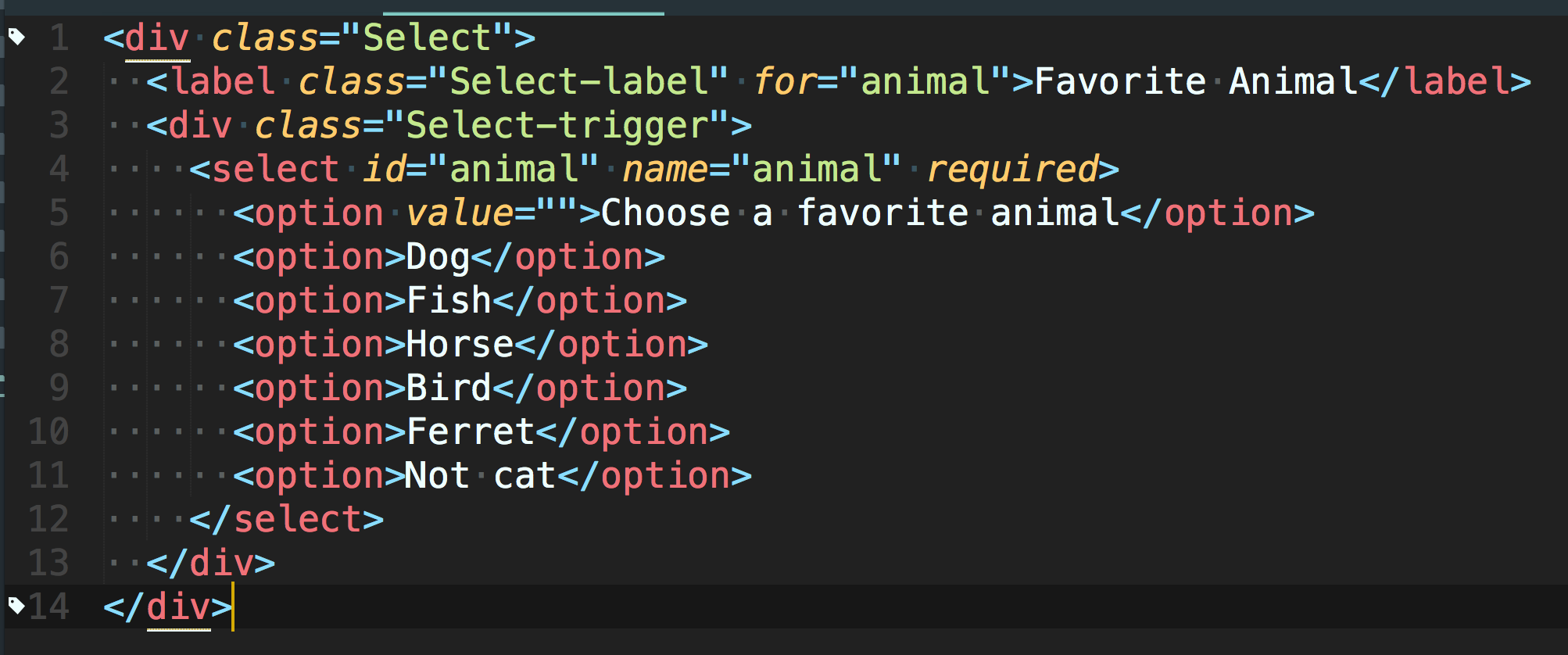
Markup: Custom Select
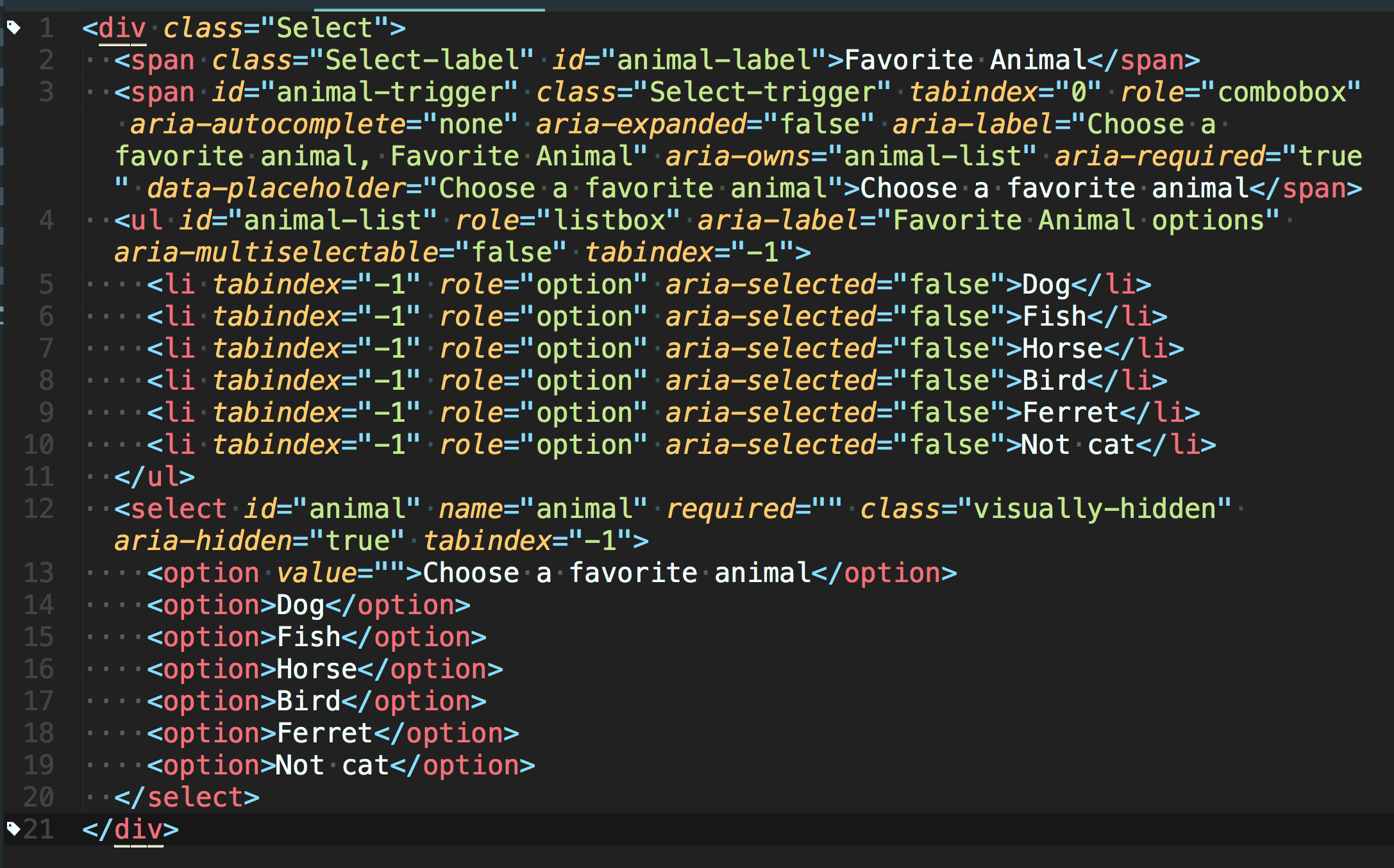
Favorite Animal
Choose a favorite animal
- Dog
- Fish
- Horse
- Bird
- Ferret
- Not cat
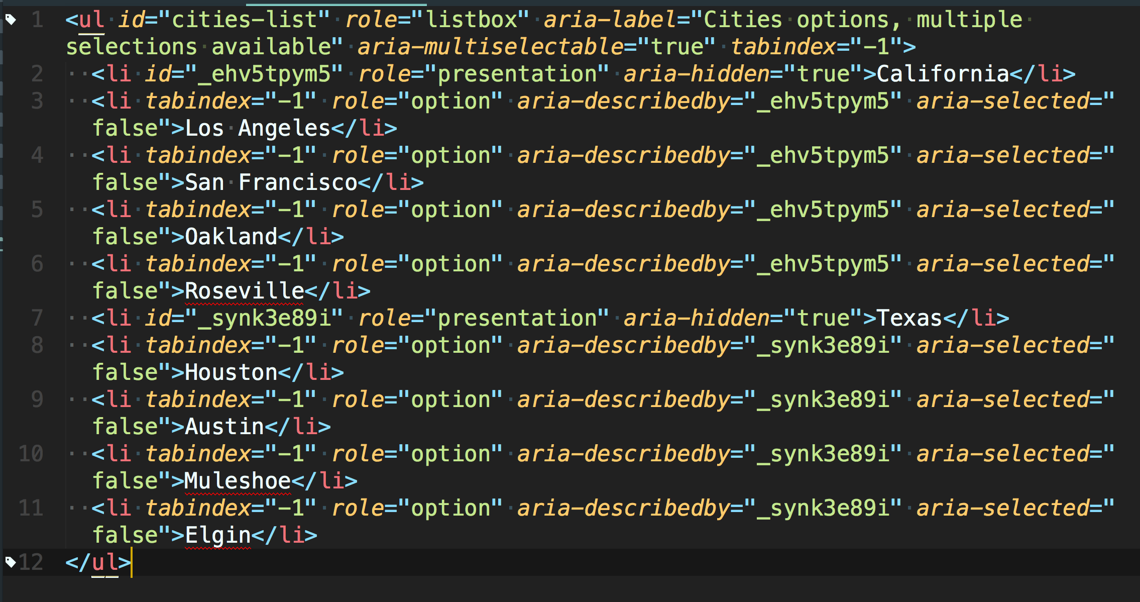
Markup: Grouped Options
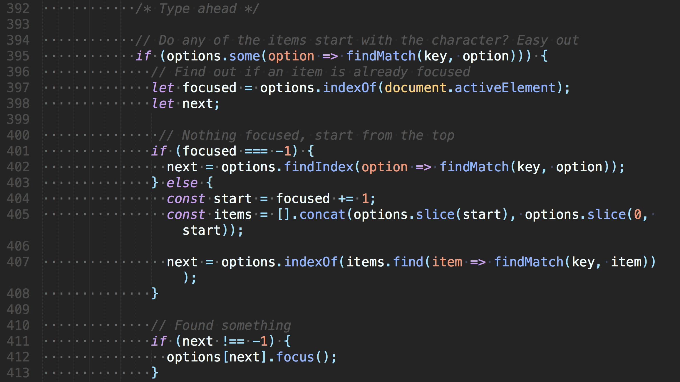
JS: Type-ahead
I know what you're thinking,
because right now I am thinking the same thing. Actually, I've been thinking about it ever since I got here. Sigh. Why oh why didn't I take the blue pill?